


Royally Underwhelmed
This month saw the unveiling of not one but two emphatically strange royal portraits. Art critics were not amused.

If art holds a mirror to society, what do the two royal portraits unveiled this month say about ours?
Because both paintings are seriously awful.
Let us begin with the portrait of King Charles, revealed in London on May 14 and the first official painting of the monarch since his coronation last year.

The work, by an artist named Jonathan Yeo, shows the king’s natural-toned face placidly staring out at us from a canvas awash with a bold palette of mottled reds—his hands, sword and crimson uniform all but blending into the fiery background.
While the piece had its fans, many others were quick to share their mockery and derision, most of them focusing on the inferno-y color scheme.


“The red is quite disturbing,” one young woman remarked to the BBC. Others told the broadcaster it looked “ghoulish” and “kind of like a massacre or something.” “Charles’s face is like a disembodied specter of death floating between violent brushstrokes,” wrote Danielle Cohen in the Cut, while the Washington Post found it “confused, obsequious, oversized and unaccountably frightening.” British art critic Hannah Black may have said it best, telling NPR: “I think a lot of people just think it is too aggressive, and it has too many colonial associations with the British Empire, ideas of blood, ideas of military and all these different things that maybe the monarchy doesn't really want to be associated with.”
Yes, it’s not the divergence from traditional portraiture here that rankles; it’s the lurid and suggestive color palette. As he began the piece, Yeo has said he worried the cherry red of the king’s Welsh Guard uniform would pop too much and distract from the monarch’s face. To avert this, Yeo opted simply to blanket the entire canvas in the same color—a kind of “if you can’t beat ‘em, join ‘em” approach to art, if you will. That he never intuited a problem with the hue’s potential evocation of hell, violence and colonial bloodshed is an oversight that won’t age well and indeed has already diminished the work in the eyes of the public.
For comparison, here is the first official painting of Queen Elizabeth II:
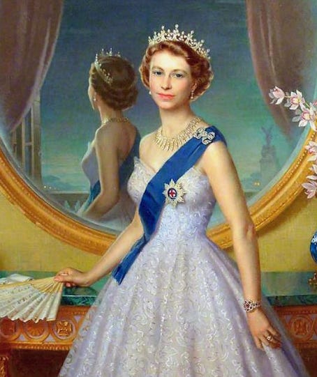
The lovely and calming blue-green palette makes me wish that Yeo had made a similar choice. Greens and blues would not only have provided a more appropriate and agreeable aesthetic; they also could have symbolized the king’s longstanding environmental activism, a personal point of pride for the monarch. Indeed, this is why King Charles himself suggested adding the butterfly we see over his right shoulder. How nice if the artist had rendered it in any shade other than carpet-burn.
Perhaps we got this disturbing painting because these are disturbing days. Maybe any glorified image of an autocrat (even an almost exclusively symbolic one) would make for uncomfortable viewing—let alone an image evoking the bloodshed often inherent to such reigns (the kind of violence that also happens to be all too immediate and real in our newsfeeds).
In a lighter vein, the second royal portrait that turned up this month is also disturbing, albeit in a different way.
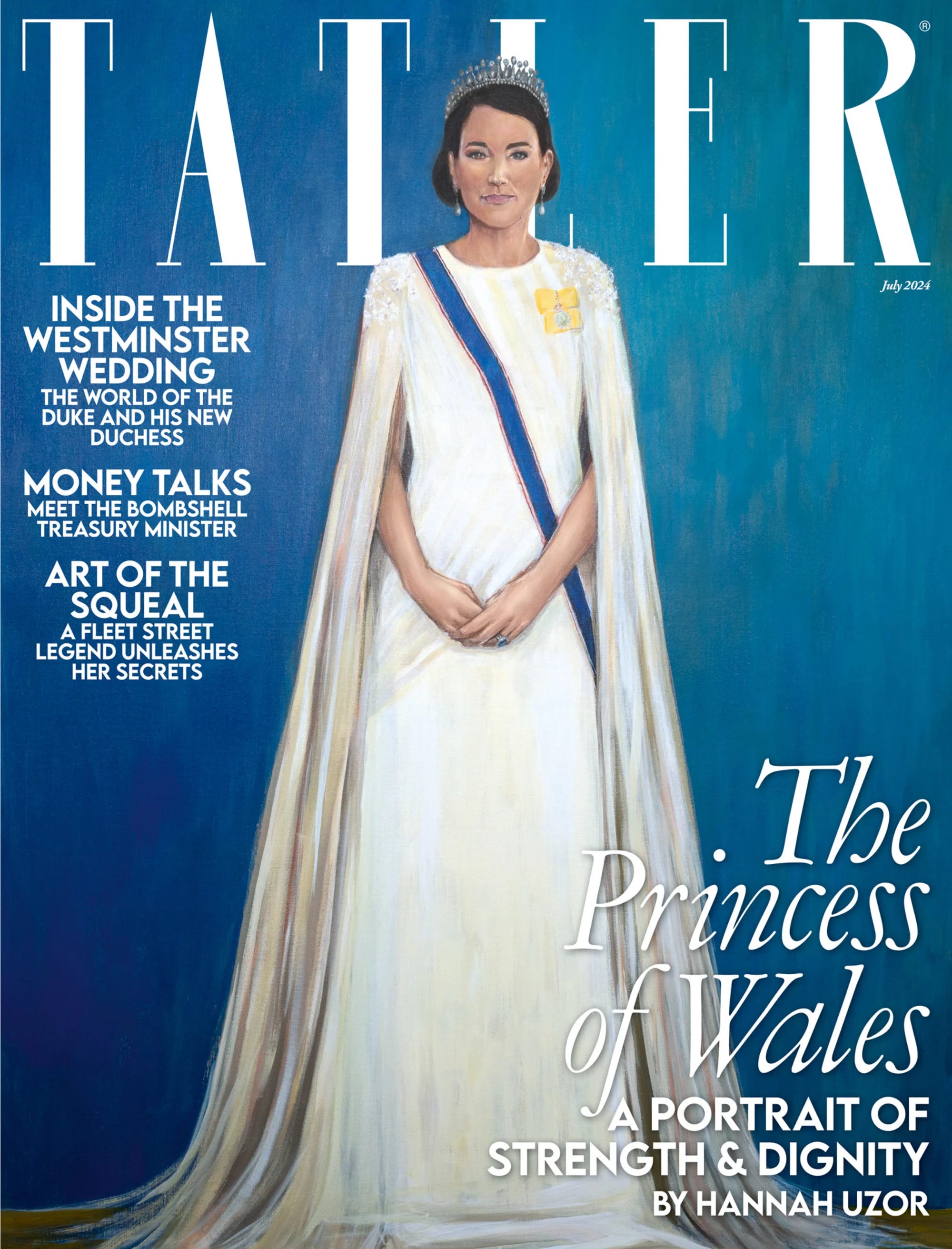
Ooh! Is that Yellowjackets star Melanie Lynskey in a new spin-off of The Crown? Cool!

Say what, now? This is meant to be the exquisite and impossibly glamorous Kate Middleton, Princess of Wales!? Shut your mouth!
Commissioned by Tatler magazine and debuting on the cover of its July 2024 issue, this amateurish-looking portrait of yes, Princess Kate, is the work of a British-Zambian artist named Hannah Uzor, who said the painting was meant to capture the royal’s soul.
Kate may seem detached and unrealistically perfect at times, but I dare say the lady has more soul than this:

Needless to say, social media users and other onlookers were (once again) ruthless.


The Daily Beast dismissed it as “godawful.” A royal biographer said the subject resembled “sort of a spinster headmistress” and a critic in the Daily Telegraph called the work “jaw-hits the floor bad,” expounding as follows:
Has there been a flatter, more lifeless royal portrait in living memory? Beneath a Lego-like helmet of unmodulated, monotonously brown “hair,” this Princess of Wales has as much charisma as a naff figurine atop a wedding cake.
Someone on Reddit wrote that there were better portraits of Kate for sale on Etsy, and I can confirm she is correct.
As with the King Charles portrait, I think this obvious misfire can also be chalked up to a strange brew of societal circumstances.
Stay with me:
Uzor’s artistic process did not involve a single in-person sitting; she has never even met the princess. Instead, Uzor based her work solely on photographs.
Nearly 200,000 of them.
“When you can’t meet the sitter in person, you have to look at everything you can find and piece together the subtle human moments revealed in different photographs,” Uzor wrote.
Ah, now I get it! Uzor’s artistic process is exactly how AI chatbots and image generators work, sifting through the entire internet to create “accurate” composites. The trouble is, as we all know by now, AI gets things wrong all the time. Maybe in crafting her approach, Uzon was just taking inspiration from the wrong place.
And heck, given AI’s infamous problem with human hands, we should count ourselves lucky that at least Kate’s look normal.
If, that is, her right hand has four and not three fingers. Hmm.

And not one person around Charles spoke up to say, "Um, perhaps this will be a problem." Awful royal advisors for the loss, again.
Don’t drag Melanie Lynskey into this. I’ve had a crush on her since “Ever After.”😍